How many subsamples are enough?
Optimizing subsample number based on plot-level, not replicate-level, variability
In field trials, stand counts help evaluate how seed treatments affect crop establishment and, ultimately, yield. But counting every plant in every plot across dozens of trials isn’t practical—especially during peak season, when the team is stretched thin with SCN sampling and other early-season assessments.
Instead, we subsample: a few fixed sections within each plot, rather than a full census. This is great if you have done field work but leads to a practical question:
How many subsamples are enough to get the job done—without wasting time?
Too few, and we introduce noise that hides treatment effects. Too many, and we burn labor we don’t have. The goal is a balance: just enough data to make confident decisions.
To find that balance, I analyzed stand count data from several trials in the soybean pathology program at OSU. The idea was to evaluate how precision changes with different numbers of subsamples, and when diminishing returns set in.
Dataset and conditions
The data come from soybean trials at NCARS, NWARS, and WARS, which are Ohio State’s research stations. Each trial used a randomized complete block design with six reps. Stand counts were collected manually in the center two (harvest) rows of each plot using a fixed one-meter stick: three counts per row, six subsamples per plot.
Stand counts were taken at the V1–V2 growth stages, when emergence is mostly complete but differences in establishment are still visible.
library(tidyverse)
library(patchwork)
library(lme4)

path = file.path("c:/Users/garnica/", "OneDrive - The Ohio State University")

dat =  read_csv(file.path(path, "stand.csv"), show_col_types = FALSE) %>%
  mutate(plot_id = as.double(interaction(site, trial,block, plot, drop = TRUE)),
         across(c(plot_id), as_factor),
         across(c(r1,r2,r3,l1,l2,l3), as.double)) %>%
  select(plot_id,r1,r2,r3,l1,l2,l3)
The dataset includes several key columns: site identifies the Ohio research location where each trial was conducted, while trial distinguishes different experiments at the same site. The columns col and row indicate the plot’s position in the field, which can be used for spatial analysis but that’s not today’s side project topic. The block column reflects the experimental design, which follows a randomized complete block structure. The plot column is a unique identifier for each plot within trial. The remaining columns—l1, l2, l3, r1, r2, and r3—contain stand counts (in plants per meters) from six subsampling locations within each plot.
Subsamples are grouped into left (l1–l3) and right (r1–r3) based on row orientation. This allows us to assess potential asymmetries in emergence due to planter performance. Each plot measures 10 feet wide (4 rows) by 30 feet long, providing a total of 36.6 meters of row length available for subsampling. Since samples are only taken from the harvesting rows, we divide the total row length by 2, resulting in 18.3 meters for the sampling process (not that it matters but anyways…).
A quick back-of-the-napkin calculation shows that one plant per meter at 30-inch row spacing is equivalent to approximately 5,300 plants per acre (feel free to do the calculations yourself). Keep that number in your head because it allows standard errors to be easily back-transformed from the stand-per-meter scale to plants per acre. For reference, the seeding rate is 140,000 seeds per acre, which is about 26.4 plants per meter in a perfect world.
We now reshape the data to long format and define the row side for each subsample.
dat_long = dat %>%
  pivot_longer(cols = c(l1, l2, l3, r1, r2, r3), names_to = "subsample", values_to = "stand") %>%
  mutate(
    stand = as.numeric(stand),
    row_side = case_when(
    grepl("^l", subsample) ~ "left",
    grepl("^r", subsample) ~ "right",
    TRUE ~ NA_character_))

glimpse(dat_long)
## Rows: 2,418
## Columns: 4
## $ plot_id <fct> 8, 8, 8, 8, 8, 8, 18, 18, 18, 18, 18, 18, 27, 27, 27, 27, 27…
## $ subsample <chr> "l1", "l2", "l3", "r1", "r2", "r3", "l1", "l2", "l3", "r1", …
## $ stand <dbl> 18, 18, 24, 21, 26, 28, 20, 16, 21, 21, 19, 28, 19, 19, 24, …
## $ row_side <chr> "left", "left", "left", "right", "right", "right", "left", "…Next, let’s take a quick look at the data distribution. No surprises expected here but visual checks are always worth it.
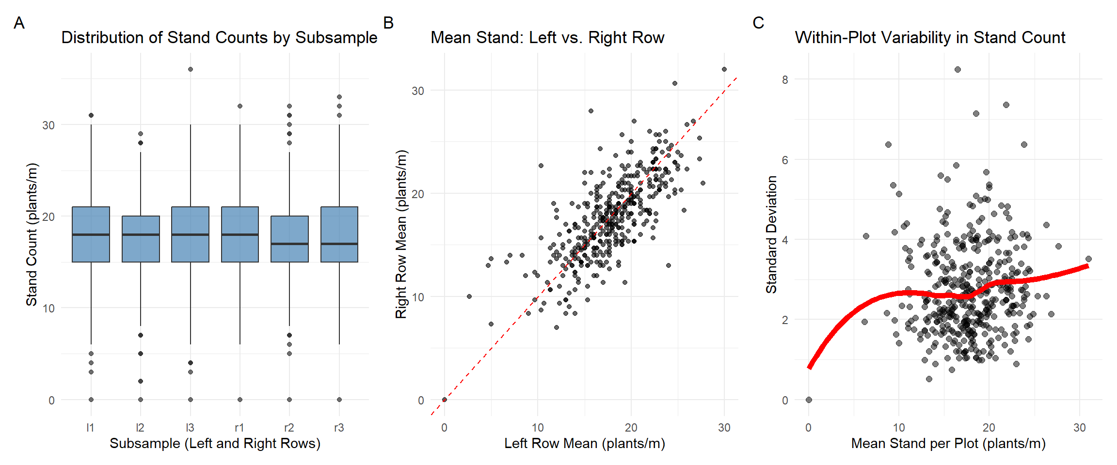
Fig. 1. Boxplot A summarizes stand count distributions across the six subsamples (l1–l3, r1–r3), capturing spatial variability within plots. Scatterplot B compares mean stand counts between left and right rows per plot; points near the 1:1 line indicate row-to-row consistency. Scatterplot C relates the plot-level mean to the within-plot standard deviation. We should expect plots with lower mean stand to show lower variability.
Random-effects models
To quantify sources of variation in stand counts, we use random-effects models. These models capture hierarchical structure and help separate between-plot from within-plot variation. Our goal is to estimate variability in stand and test whether subsample structure (e.g., row side) contributes meaningfully.
1) Baseline random intercept model
We start with a simple random intercept model for stand count \(y_{ij}\), where \(j\) indexes subsamples within plot \(i\):
\[ y_{ij} = \mu + b_i + \varepsilon_{ij} \]
where
- \(\mu\): overall mean (fixed intercept),
- \(b_i \sim \mathcal{N}(0, \sigma^2_{\text{plot}})\): random effect for plot,
- \(\varepsilon_{ij} \sim \mathcal{N}(0, \sigma^2_{\text{residual}})\) residual variation at the subsample level.
mod1 = lmer(stand ~ 1 + (1|plot_id), data = dat_long, REML = TRUE)
VarCorr(mod1)
## Groups Name Std.Dev.
## plot_id (Intercept) 3.6490
## Residual 2.9687The between-plot variability \(\sigma^2_{\text{plot}}\) (variation in average stand across plots) is \(3.649^2 = 13.31\). This measures how different the average stand counts are between plots. A higher value indicates more variability from plot to plot. The residual variance \(\sigma^2_{\text{residual}} = 2.9687^2 = 8.82\) captures how much individual subsamples differ from their plot average. It includes noise, measurement error, and row/subsample-level micro-variation.
Total variance of observation \(y_{ij}\) is
\[ \text{Var}(y_{ij}) = \sigma^2_{\text{plot}} + \sigma^2_{\text{residual}} = 22.13 \]
Intraclass correlation coefficient (ICC)
The ICC reflects the proportion of total variance due to between-plot differences:
\[ \text{ICC} = \frac{\sigma^2_{\text{plot}}}{\sigma^2_{\text{plot}} + \sigma^2_{\text{residual}}} \]
In R, we can write this as:
vc = as.data.frame(VarCorr(mod1))
var_plot     = vc[vc$grp == "plot_id", "vcov"]
var_resid    = attr(VarCorr(mod1), "sc")^2
var_total = var_plot + var_resid
icc = var_plot / var_total;icc
## [1] 0.6017259This tells us that approximately 60.1% of the total variance in stand counts is due to differences between plots and the remaining is due to intra-plot variability.
While this model is a good starting point, it assumes that all subsamples within a plot are exchangeable—it does not account for:
- Differences between left vs. right rows
Next, we introduce this factor to refine our understanding of within-plot variability.
2) Row side as a fixed effect
Including row_side as a fixed effect allows us to test whether there is a systematic mean difference in stand between the left and right rows across plots. However, there’s an important caveat: the labels “left” and “right” may not consistently reflect the same physical orientation in the field. For example, if the planter always moves in the same direction, left and right consistently refer to the same sides of the planter. But if planting follows a serpentine pattern (alternating directions), the same side of the planter might be labeled “left” in one pass and “right” in the next. In that case, the label reflects position relative to the viewer, not field machinery.
This limits the interpretability of row_side as a biologically or operationally meaningful factor. Still, we fit the model to assess whether there is a consistent average difference in stand between rows.
\[ y_{ijk} = \mu + \alpha_k + b_i + \varepsilon_{ijk} \]
where
- \(\mu\): overall mean (fixed intercept),
- \(\alpha_k\): fixed effect of side \(k ∈\) {left, right},
- \(b_i \sim \mathcal{N}(0, \sigma^2_{\text{plot}})\): random effect for plot \(i\),
- \(\varepsilon_{ijk} \sim \mathcal{N}(0, \sigma^2_{\text{residual}})\): residual error.
mod2 = lmer(stand ~ 1 + row_side +(1|plot_id), data = dat_long, REML = TRUE)
VarCorr(mod2)
## Groups Name Std.Dev.
## plot_id (Intercept) 3.6492
## Residual 2.9677The estimated row side effect (\(\alpha_k\)) is –0.186 (not shown), suggesting slightly lower stand counts on the right row on average. However, the effect is not statistically significant. The variance components are nearly unchanged from the baseline model.
We can explore this visually by computing left–right differences in average stand per plot:
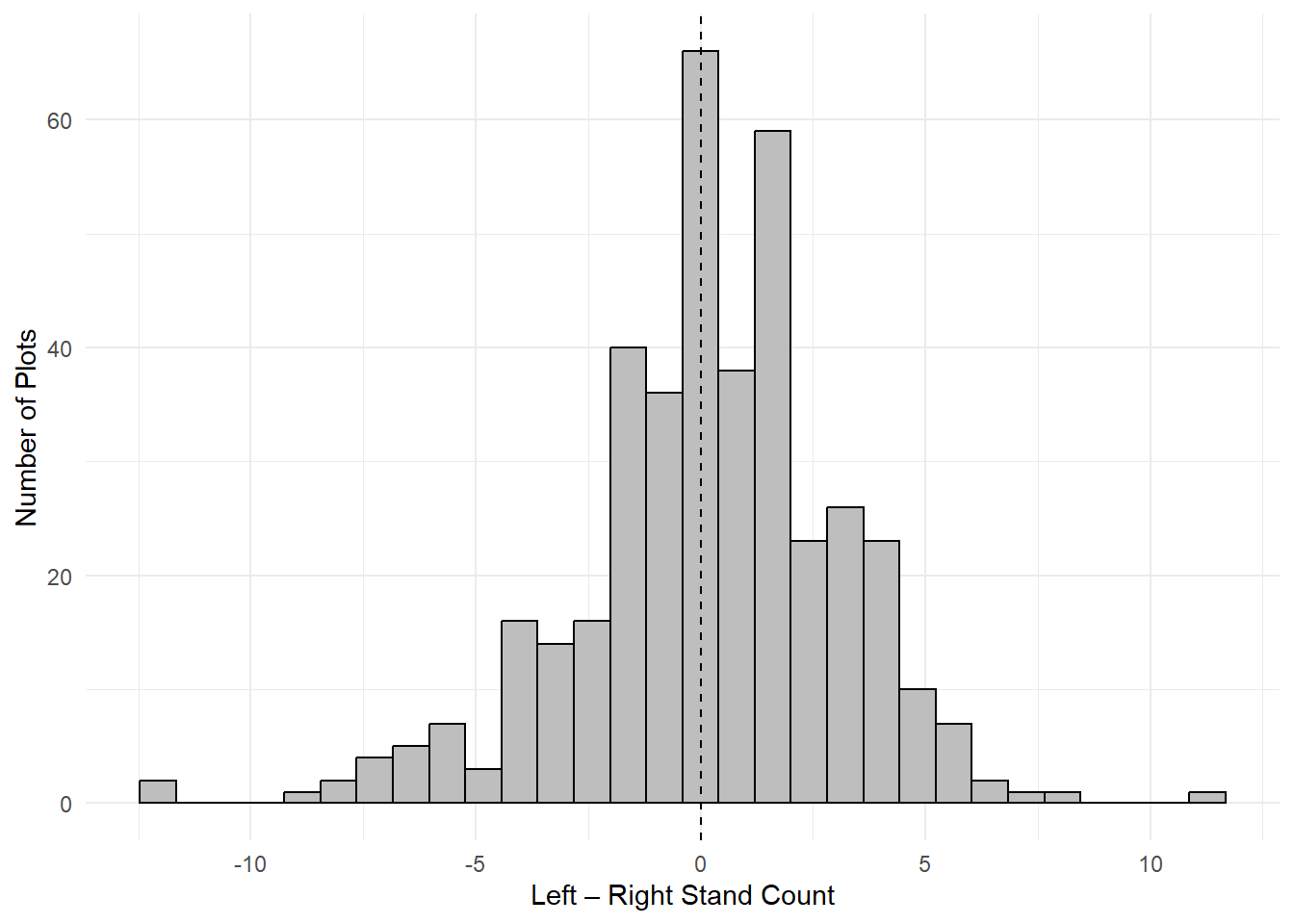
Fig. 2. Distribution of within-plot differences in stand counts between left and right row sides. Histogram displays the difference in mean stand counts per plot (left – right), based on all subsamples within each row side. The dashed vertical line at zero indicates perfect symmetry.
Another way to formally test whether mean stand differs by row side, we use a paired t-test:
t.test(stand_side_summary$left, stand_side_summary$right, paired = TRUE)##
## Paired t-test
##
## data: stand_side_summary$left and stand_side_summary$right
## t = 1.2551, df = 402, p-value = 0.2102
## alternative hypothesis: true mean difference is not equal to 0
## 95 percent confidence interval:
## -0.1056323 0.4786678
## sample estimates:
## mean difference
## 0.1865178As mentioned before, while the estimated difference in stand between left and right rows is small and not statistically significant, this result should be interpreted with caution. The row_side labels may not consistently represent the same physical side of the planter or field due to alternating planting directions (serpentine patterns). As a result, any real row-to-row differences in emergence—caused by planter variability, tire compaction, or edge effects—may be masked by the inconsistent labeling.
Thus, the lack of significance does not imply row sides are truly equivalent, only that the current labeling scheme may not reliably capture physical asymmetries across plots.
3) Row side as a random effect nested within plot
If we suspect that stand counts systematically differ between the two rows within a plot—but that the meaning of “left” and “right” is inconsistent across plots—then treating row_side as a random effect nested within plot is a better approach than using it as a fixed effect.
This specification captures within-plot row-level heterogeneity without relying on the labels “left” and “right” to carry any consistent directional meaning. What matters is that each plot has two rows, and those rows may differ in stand due.
In this model, we treat row_side as a random effect specific to each plot:
\[ y_{ijk} = \mu + \alpha_{k(i)} + b_i + \varepsilon_{ijk} \]
- \(\mu\): overall mean (fixed intercept),
- \(\alpha_{k(i)} \sim \mathcal{N}(0, \sigma^2_{\text{row:plot}})\): random effect for row side \(k\) nested within plot \(i\),
- \(b_i \sim \mathcal{N}(0, \sigma^2_{\text{plot}})\): random plot effect,
- \(\varepsilon_{ijk} \sim \mathcal{N}(0, \sigma^2_{\text{residual}})\): subsample-level residual error (variation between subsamples within row).
mod3 = lmer(stand ~ 1 + (1|plot_id/row_side), data = dat_long, REML = TRUE)
VarCorr(mod3)
## Groups Name Std.Dev.
## row_side:plot_id (Intercept) 1.3785
## plot_id (Intercept) 3.5433
## Residual 2.7700This model includes an additional variance component representing variation between row sides within each plot. The estimated variance \(\sigma^2_{\text{plot:row}} = 1.3785^2 = 1.90\) shows that this within-plot variation is not huge but it is not zero either. On the scale of plants per acre, this corresponds to a standard deviation of approximately 10,000 plants per acre between row sides.
Variance decomposition and ICC
We now partition the total variance among the three sources:
\[ \text{ICC} = \frac{\sigma^2_{\text{plot}}}{\sigma^2_{\text{plot}} + \sigma^2_{\text{row:plot}} +\sigma^2_{\text{residual}}} \]
In R, we can write this as:
vc = as.data.frame(VarCorr(mod3))
var_row   = vc[vc$grp == "row_side:plot_id", "vcov"]
var_plot  = vc[vc$grp == "plot_id", "vcov"]
var_resid = attr(VarCorr(mod3), "sc")^2
var_total = var_plot + var_row + var_resid
icc_plot = var_plot / var_total;icc_plot
## [1] 0.5673863icc_row = var_row / var_total;icc_row## [1] 0.08587233iic_sub= var_resid / var_total;iic_sub## [1] 0.3467414The ICC is estimated at 0.567, meaning that approximately 56.7% of the total variance in stand counts is attributable to differences between plots. Row-side within-plot variance accounts for ~8.6% and residual subsample-level variance accounts for the remaining ~34.7%. This confirms that most variation arises between plots, but row-level variation within plots is non-negligible. Also, the total variance hasn’t changed—we’re just decomposing it with greater resolution by introducing another level (row side within plot).
To evaluate whether accounting for row-side variation improves model fit, we compare a baseline random intercept model to a nested model using maximum likelihood estimation (REML = FALSE). This is the same as asking: Does allowing for random variation between row sides within plots explain additional variation in stand counts beyond plot-level differences alone?
mod2a = lmer(stand ~ 1 + (1 | plot_id), data = dat_long, REML = FALSE)
mod3a = lmer(stand ~ 1 + (1 | plot_id/row_side), data = dat_long, REML = FALSE)
anova(mod2a, mod3a)
## Data: dat_long
## Models:
## mod2a: stand ~ 1 + (1 | plot_id)
## mod3a: stand ~ 1 + (1 | plot_id/row_side)
## npar AIC BIC logLik deviance Chisq Df Pr(>Chisq)
## mod2a 3 13054 13072 -6524.3 13048
## mod3a 4 13001 13024 -6496.6 12993 55.25 1 1.061e-13 ***
## ---
## Signif. codes: 0 '***' 0.001 '**' 0.01 '*' 0.05 '.' 0.1 ' ' 1The model comparison using anova(mod2a, mod3a) shows that including the nested random effect for row_side significantly improves model fit. This suggests that even though row-side accounts for only ~9% of the variance.
This result might seem counterintuitive at first—especially since the variance component is small and row_side is not significant as a fixed effect. However, fixed and random effects capture different things:
As a fixed effect,
row_sidewould test for consistent differences between left and right sides across all plots—something we don’t expect here.As a random effect,
row_sideaccounts for plot-specific asymmetries (e.g., compaction or shading differences), which are randomly varying across plots but still systematic within each one.
In short, including row_side as a nested random effect improves model fit because it captures within-plot structure—variation that would otherwise be absorbed as unstructured residual noise. Even though the variance component is relatively small, it represents non-random spatial heterogeneity that meaningfully contributes to the model’s explanatory power.
That said, if the goal isn’t to fit a fully hierarchical model—perhaps because the added complexity yields only modest gains—I would still strongly recommend sampling both harvesting rows and averaging their values (guess what, we do this already!). This ensures that asymmetries between rows are accounted for in the estimate, even if not explicitly modeled.
As for how many subsamples to collect per row—that’s exactly what the analysis below sets out to determine.
Precision of plot mean estimates
This analysis evaluates how the number of subsamples per row side influences the precision of plot-level stand count estimates. The goal is to identify a sampling strategy that balances efficiency and accuracy—minimizing labor without compromising data quality. While differences between row sides within a plot are generally small, they are systematic rather than random, and should be accounted for in the sampling design. So we respect that in the procedure below.
Theoretical standard error calculation
I use variance components from a linear mixed-effects model to derive the theoretical standard error (SE) of the mean for a given plot. Each plot contains \(J = 2\) row sides and \(K\) subsamples per row side, for a total of \(J \cdot K\) subsamples. For our case, the mean for a given plot is:
\[ \bar{y}_i = \frac{1}{J \cdot K} \sum_{j=1}^J \sum_{k=1}^K y_{ijk} \]
The variance of \(\bar{y}_i\) is:
\[ \mathrm{Var}(\bar{y}_i) = \mathrm{Var}\left(\frac{1}{J \cdot K} \sum_{j=1}^J \sum_{k=1}^K (\mu + \alpha_i + \beta_{j(i)} + \varepsilon_{k(ij)})\right) \]
Since \(\mu\) is constant, and \(\alpha_i\) is constant within plot \(i\), the variance simplifies to:
\[ \mathrm{Var}(\bar{y}_i) = \mathrm{Var}\left(\alpha_i + \frac{1}{J} \sum_{j=1}^J \beta_{j(i)} + \frac{1}{J \cdot K} \sum_{j=1}^J \sum_{k=1}^K \varepsilon_{k(ij)}\right) \]
Assuming independence and homoscedasticity, the variance becomes:
\[ \begin{aligned} \mathrm{Var}(\bar{y}_i) &= \sigma^2_{\text{plot}} + \frac{1}{J^2} \cdot J \cdot \sigma^2_{\text{row:plot}} + \frac{1}{(J \cdot K)^2} \cdot J \cdot K \cdot \sigma^2_{\text{residual}} \\ &= \sigma^2_{\text{plot}} + \frac{\sigma^2_{\text{row:plot}}}{J} + \frac{\sigma^2_{\text{residual}}}{J \cdot K} \end{aligned} \]
However, when assessing the precision of the mean estimate within a single plot (i.e., ignoring variation among plots), the between-plot variance \(\sigma^2_{\text{plot}}\)is excluded. Thus, the relevant variance is
\[ \begin{aligned} \mathrm{Var}(\bar{y}_i) &= \frac{\sigma^2_{\text{row:plot}}}{J} + \frac{\sigma^2_{\text{residual}}}{J \cdot K} \end{aligned} \]
which quantifies the sampling variance of the plot mean estimator given the nested sampling design.
Formulas are boring but they clearly show you that as \(K\) increases, \(\frac{\sigma^2_{\text{residual}}}{J \cdot K}\) decreases, improving precision. Another thing it tells you is that the \(\frac{\sigma^2_{\text{row:plot}}}{J}\) term is constant with respect to \(K\) (it does not depend on it). Thus, there is diminishing return as \(K\) grows because the only term decreasing with \(K\) is residual variance contribution.
Theoretical SE calculation
To find the point of diminishing returns, we calculated the theoretical SE for \(K = 1 to 10\). Even with only three subsamples per row, stats lets us extrapolate and optimize sampling—one reason it’s worth knowing the math.
calculate_se_nested = function(k, j, sigma_row, sigma_resid) {
  sqrt((sigma_row^2) / j + (sigma_resid^2) / (j * k))
}

j = 2  # row sides per plot

k_values = 1:10
se_curve_nested = tibble(
  k = k_values,
  se = round(calculate_se_nested(k_values, j = j, sigma_row = sigma_row, sigma_resid = sigma_resid),2)
)

se_curve_nested %>%
  mutate(
    se_reduction = round(lag(se) - se, 2),
    relative_reduction = round(se_reduction / lag(se), 2),
    percent_reduction = round(relative_reduction * 100, 2)
  )  %>%
  select(
    `Number of Subsamples (K)` = k,
    `Standard Error` = se,
    `SE Reduction` = se_reduction,
    `Percent Reduction (%)` = percent_reduction
  ) %>%
  kableExtra::kable(align = "c", format = "html") %>%
kableExtra::kable_styling(full_width = FALSE, position = "center")| Number of Subsamples (K) | Standard Error | SE Reduction | Percent Reduction (%) |
|---|---|---|---|
| 1 | 2.19 | NA | NA |
| 2 | 1.69 | 0.50 | 23 |
| 3 | 1.49 | 0.20 | 12 |
| 4 | 1.38 | 0.11 | 7 |
| 5 | 1.31 | 0.07 | 5 |
| 6 | 1.26 | 0.05 | 4 |
| 7 | 1.22 | 0.04 | 3 |
| 8 | 1.20 | 0.02 | 2 |
| 9 | 1.17 | 0.03 | 3 |
| 10 | 1.15 | 0.02 | 2 |
The theoretical standard error calculations illustrate three distinct phases in precision gains associated with increasing subsamples per row side. In the initial rapid improvement phase \((K = 1\text{–}3)\), each additional subsample yields large reductions in SE (11.8–22.6%), offering a high return on sampling effort. Notably, increasing from 1 to 2 subsamples provides the largest gain (~22.6%) with minimal added effort, making 2 subsamples a practical and efficient choice in many contexts. Between \(K = 3\text{–}6\), diminishing returns begin: SE reductions moderate to 5–15% per additional subsample, so further increases in \(K\) should be carefully balanced against labor costs. Beyond \(K=6\), an asymptotic phase is reached where precision gains are not offset by additional subsampling.
I believe choosing \(K = 2\) does the job, on average.
Empirical validation
We use simulation to estimate the standard error of plot means across subsample sizes \(K\). The goal is to identify the “elbow” in the SE curve — the point beyond which increasing \(K\) yields only marginal reductions in standard error. Beyond this point, additional sampling effort does not produce proportional gains in precision.
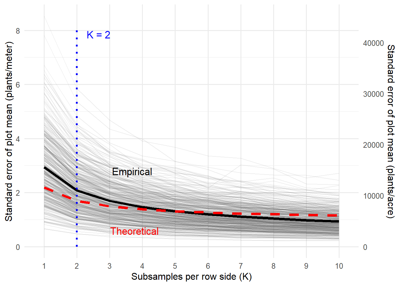
Fig. 3. Theoretical and empirical standard errors of plot-level stand estimates as a function of subsamples per row side (\(K\)). Theoretical SE (red dashed line) are calculated from variance components of the nested linear mixed-effects model, while empirical SE (black solid line) are derived from simulation with repeated random subsampling. Both curves demonstrate diminishing returns in precision gains as \(K\) increases, validating the theoretical model and supporting an efficient sampling intensity. \(K = 2\) is highlighted to show marginal gains in precision beyond that point.
Conclusion
This analysis supports collecting two 1-meter subsamples per row side when estimating stand counts in soybean trials. This sampling effort captures within-plot variability efficiently, offering a balance between precision and labor. For trials not focused on seed treatment effects, even a single subsample may suffice (Yes, you can improve your fungicide model by including stand count as a covariate. Since stand is a non-confounding effect, adjusting for it helps control variability without biasing treatment effects)
Justification:
Most variance (57%) occurs between plots, driven by treatment or site differences. This limits the precision gains from within-plot sampling.
Row-side variation accounts for about 9% of stand variability. Since seed treatment trials require at least four one-meter stand measurements, sampling from each harvesting row (two per row) is preferable and supported by this analysis.
Increasing from 1 to 2 subsamples from whtin row reduces standard error by ~23% (from 2.19 to 1.69 plants/meter); a third adds another 12%, but further gains quickly diminish, falling below 2% beyond 8 subsamples.
One of the most interesting takeaways from this analysis is that, even though the residual variance is fairly high (7.67), increasing the number of subsamples per plot doesn’t translate into continuous improvements in precision. This plateau in standard error reduction isn’t just because of plot-to-plot variation, but more likely due to the structure of the residual noise itself. In this case, the residual variation probably stems from spatially localized field effects—like uneven seed emergence, soil crusting, or patchy disease—which introduce variability that’s not independent across subsamples. When subsamples are taken from areas influenced by the same micro-environmental factors, they tend to reflect similar conditions. So, adding more subsamples in those areas doesn’t really add new information—it just reinforces what’s already been captured. In theory, increasing sample size should reduce standard error by the square root of the sample size, but that assumes the residuals are uncorrelated. If they’re spatially autocorrelated (which seems likely here), then that assumption breaks down.
In short, while it may seem like high residual variance should be reducible with more sampling, the biological reality in field trials sets a limit. After about 3 or 4 subsamples, the returns diminish because much of the remaining noise is structured, not random. These insights also can be used to inform decisions about replication and sampling in other contexts, such as disease severity or treatment effect detection, though those applications are beyond this project’s scope.
Vini Garnica
Postdoctoral Scholar
My research interests include agronomy and plant pathology matter.